
Which savings rate matters?
The Q2 GDP revisions paint a brighter picture of the British economy. But the sectoral accounts contain more clues about the future.


GDP data is a bit like a polaroid photograph, in that it takes a while to develop. The broad outlines become clear relatively quickly, but the detail gets sharper over time. Today the ONS released its new estimates of Q2 GDP and the British economic picture not only became clearer but a touch brighter too.
The headlines make for cheery reading. Growth in the second quarter was revised up from 4.8% to 5.5% and the scale of the decline in the first quarter notched back a touch. After the revisions real GDP is now estimated (and it is worth remembering that the picture is still developing and we are dealing with estimates) to have been 3.3% below the pre-pandemic level at the end of June rather than 4.4% below.
Those revisions move the UK being from the relative laggard of the G7 to a mid-table position.
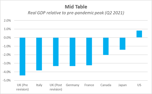
Cross country comparisons of GDP are somewhat more tricky than usual at the moment – different national statistical offices have been applying different accounting treatments to non-market output such as health care and education. So it is worth taking such data with more than the usual pinch of salt.
It is though worth noting, that nominal (that is to say, in money terms) British GDP was 1.7% above its pre-crisis level in Q2 while it remained below it in France, Germany, Japan and Italy.
The silver lining of better than previously believed growth might come with something of a cloud. Analysts are already pondering whether the smaller gap, relative to the pre-pandemic level, will bring forward Bank of England rate rises. A faster recovery, all things being equal, should mean less spare capacity in the economy and more inflationary pressure. But all things are not equal. Yes, growth in Q1 and Q2 was better than believed but the economy hit a speed bump in July as cases surged. That weakness looks to have lingered on into at least August. The 7.25% growth forecast for 2021 that accompanied the August Monetary Policy Report looks increasingly to have been too optimistic.
But much as (recent) economic history is fascinating to ponder in and of itself, June already feels like a long time ago. Today’s data releases are also helpful in understanding the future. Especially the latest sectoral accounts.
It has been obvious since the early days of the pandemic that what happens to the large household savings balances accumulated over the course of the lockdowns will be a major factor in determining the pace of the recovery.
Real household disposable income held up pretty well considering the sheer scale of the fall in GDP thanks in no small part to the furlough scheme (which ends today) and the temporary uplift in Universal Credit (due to expire next week).
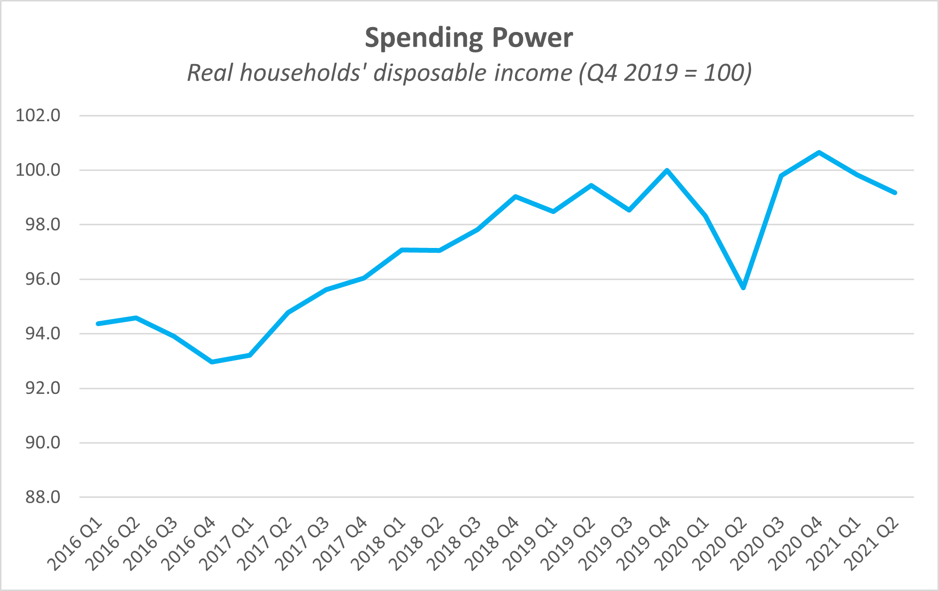
The coming months will be tougher. Furlough is ending, UC is being cut, the domestic energy price cap is heading up and inflation looks set to be around the 4% mark this Autumn. And then, in April, the NICS increase to fund the NHS and social care will take another bite out of payrolls.
A falling household savings ratio (the percentage of their available income that households forego from spending) has the potential to not only cushion but perhaps even counteract that blow at the macroeconomic level1. Even if income growth is soggy, falling savings levels could prop up spending.
As the ONS put it in their quarterly round up today:
…the pandemic led to an increase in enforced savings as restrictions were in place. The household saving ratio stood at 11.7% in Quarter 2 2021 as there was a sharp recovery in household consumption, particularly in restaurants and transport. There is uncertainty around how any accumulated savings will be spent and if the higher level of infections might lead to some increased cautionary behaviour.
It seems reasonable to expect some precautionary savings to continue even as the economy gradually normalises. Certainly, that was the pattern after the last recession when, after an initial spike, the household savings ratio settled at a higher rate than before the crisis. The ratio averaged 6.3% between 2001 and 2006 but 8% between 2011 and 2016.
But I do wonder whether people are looking at the right household savings ratio when trying to work out the path of consumer spending?
The ONS public two series: the internationally comparable measure which is usually discussed and, since 2017, an experimental series on a cash basis.
The traditional measure includes many transactions which are not directly experienced by households but are instead imputed. For example, the “imputed rent” received by homeowners (i.e. the value of their consumption of housing services from the property they own) or changes in future pension entitlements.
The experimental data series strip this out and instead attempts to measure real household income, spending and savings on a cash basis.
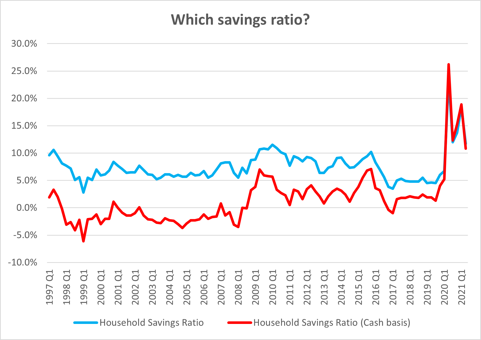
It is almost certainly a better measure of how households experience their savings behaviour on a month-by-month basis2.
The two measures spiked to very similar levels over the pandemic but, on a cash basis, the initial starting point was lower, and so: it has more potential to fall in the quarters ahead.
Betting against the willingness of the British consumer to spend is rarely a sensible trade.
It is important to remember that aggregated numbers on household incomes and savings hide wildly different outcomes across the income spectrum.
It also shows the deterioration in household balance sheets during the pre-2008 credit boom much more clearly.